2 図示化の練習
ネットで公開されているData Visualizationを参考に、Rのggplotを用いた図示化をやってみよう。邦訳本は『データ分析のためのデータ可視化入門』。
序文、第1章には、なぜ図示化する必要があるのか、図示化する際の注意点が丁寧に書かれているので、読むとよい。
図示化するにあたって Data Visualizationの序文に書いてある図示する際に必要となるパッケージをダウンロードしよう。
2.1 第2章の練習
2.1.1 csvファイルの読込み・保存
@第2章 csvファイルとは、カンマ区切りで情報が整理されたファイルのことで、見た目はExcelファイルに近い。
第2章に書かれているcsvファイルを保存してみましょう。 まず、csvという名前でR Projectと同じレイヤーでフォルダーを作成してください。
# パッケージの読込み
library(tidyverse)
library(here)

# 公開されている臓器提供に関するcsvファイルをダウンロード
## ダウンロードしたcsvに名前を付ける
url <- "https://cdn.rawgit.com/kjhealy/viz-organdata/master/organdonation.csv"

# csvファイルの読込み
## 「<-」のショートカットは「alt + -」
df_donor <- read_csv(url)

# csvファイルとして保存
## 書きかた1
write_csv(df_donor, here("csv", "donor.csv"))

## 書きかた2
### スラッシュはフォルダーレイヤーを表す。
### この場合、csvフォルダーの中にdonor.csvを作るように指示
write_csv(df_donor, "csv/donor.csv")
gampminderの読込みがうまくできない場合、R Studioの左下パネルにあるConsoleで
install.packages(“gapminder”)
と入力してから読み込む。
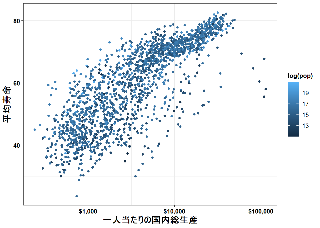
gapminderは各国の平均寿命やGDP、人口のデータが格納されている。
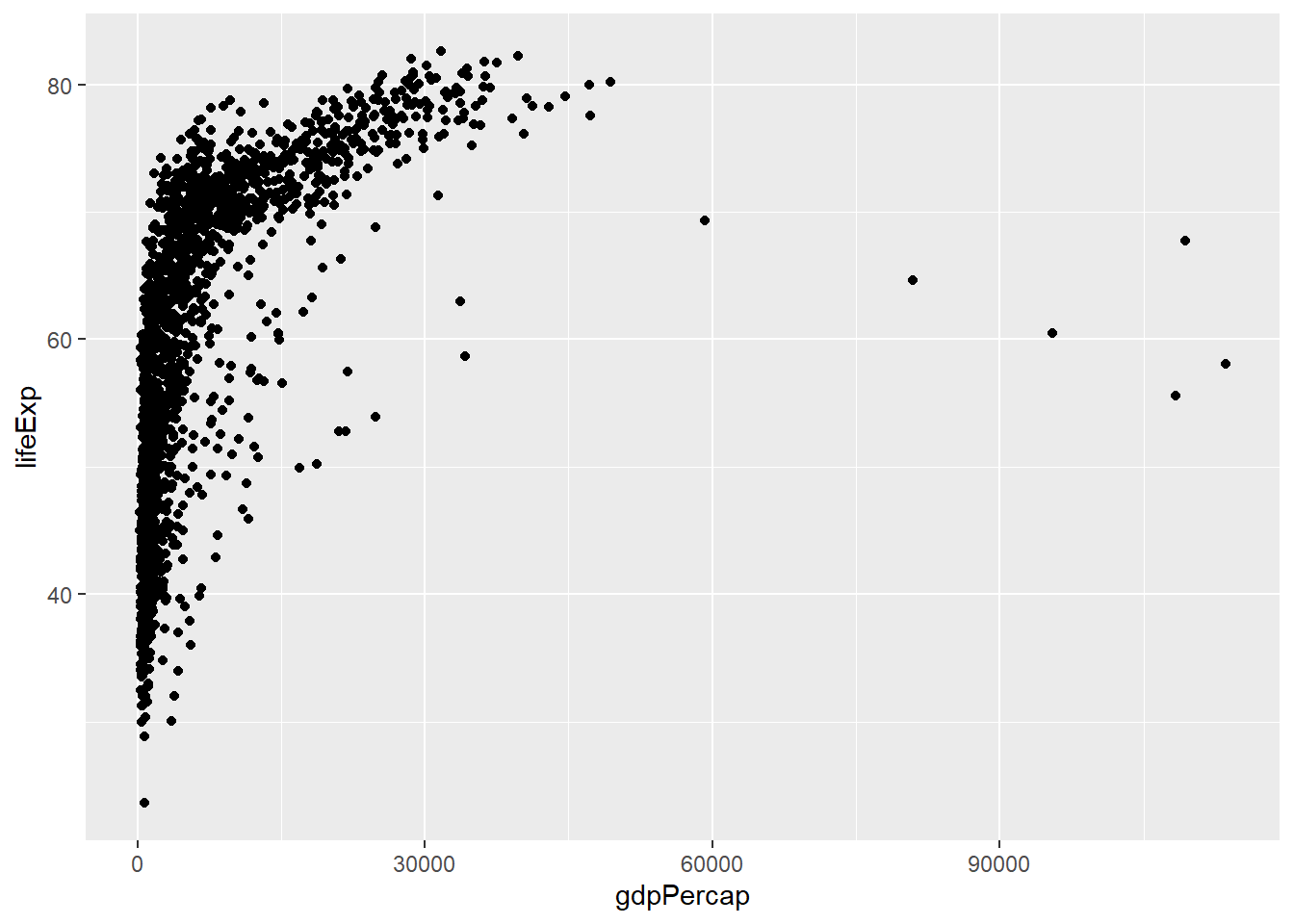 これがデフォルトでの表示。データの傾向を見るだけならば悪くない。
2.2 第3章の練習
散布図の上に、散布図に基づいた曲線を当てはめてみよう。
       # 「data = 」は省略可
ggplot(gapminder,
       # 「mapping = 」も省略可
       aes(x = gdpPercap,
           y = lifeExp)) +
geom_point() +
# gam: Generalized Additive Model (GAM)、一般化加法モデル
geom_smooth(method = "gam")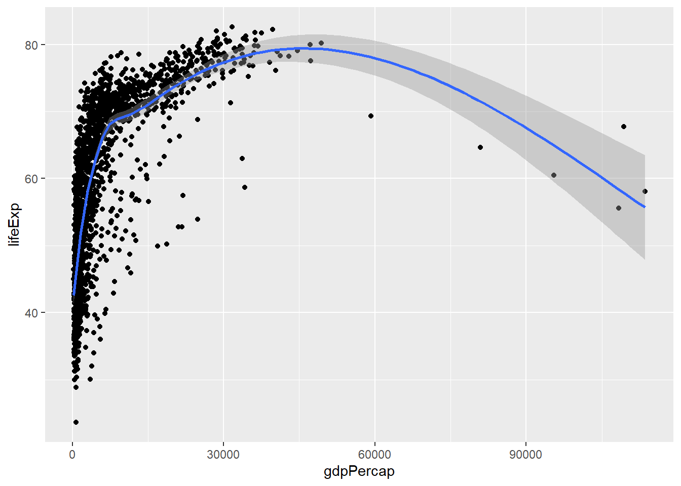
散布図と曲線を表示できた。GAMの詳細はとりあえずわからなくて大丈夫。
次にGDPに対数を取って表示してみよう。
# 「data = 」は省略可
ggplot(gapminder,
# 「mapping = 」も省略可
aes(x = gdpPercap,
y = lifeExp)) +
geom_point() +
# lm: Linear Model (LM)、線形モデル
geom_smooth(method = "lm") +
scale_x_log10()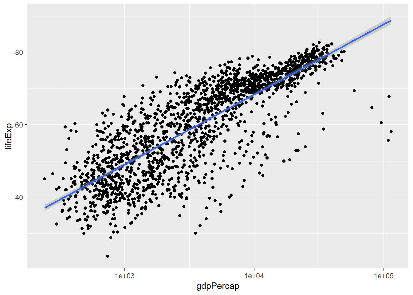 いい感じ。LMの詳細は分からなくて大丈夫。
図を整形してみよう。 まずは散布図と回帰直線。そして、軸タイトル。
ggplot(gapminder,
       # 「mapping = 」も省略可
       aes(x = gdpPercap,
           y = lifeExp)) +
  geom_point(alpha = 1.5,          # 色の濃度指定
             color = "deepskyblue", # 色指定
             shape = 4) +      # 散布図の記号指定
  geom_smooth(method = "lm",           # lm: Linear Model (LM)、線形モデル
              fill = "lightblue",      # 95%信用区間の色指定
              color = "deepskyblue",   # 回帰直線の色指定
              alpha = 0.7,
              size = 0.5) +      # 記号のサイズ指定
  scale_x_log10(labels = scales::dollar) + # ドル表示に変更
  labs(x = "一人当たりの国内総生産",
       y = "平均寿命")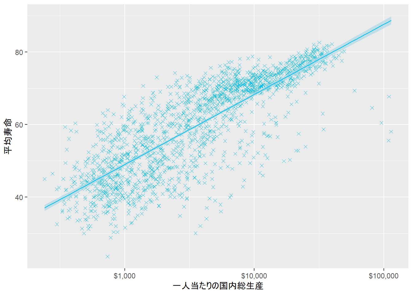
ggpubr(じーじーぱぶあーる)パッケージをダウンロード、読込み、論文形式の図に整形しよう。
library(ggpubr) # 論文掲載用に設計されたパッケージ
ggplot(gapminder,
# 「mapping = 」も省略可
aes(x = gdpPercap,
y = lifeExp)) +
geom_point(alpha = 1.5, # 色の濃度指定
color = "deepskyblue", # 色指定
shape = 4) + # 散布図の記号指定
geom_smooth(method = "lm", # lm: Linear Model (LM)、線形モデル
fill = "lightblue", # 95%信用区間の色指定
color = "deepskyblue", # 回帰直線の色指定
alpha = 0.7,
size = 0.5) + # 記号のサイズ指定
scale_x_log10(labels = scales::dollar) + # ドル表示に変更
theme_pubr() + # 無地背景に指定
labs_pubr() + # 軸タイトルのフォントとサイズを指定
labs(x = "一人当たりの国内総生産",
y = "平均寿命")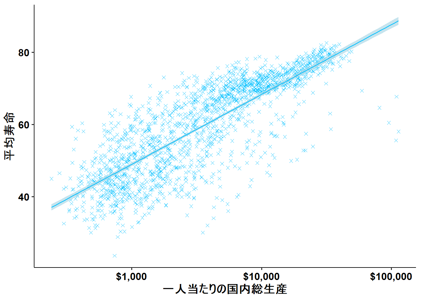 結構、論文形式ぽくなった。個人的には、補助線が欲しいので、theme_pubr()からtheme_bw()に変更する。
ggplot(gapminder,
       # 「mapping = 」も省略可
       aes(x = gdpPercap,
           y = lifeExp)) +
  geom_point(alpha = 1.5,          # 色の濃度指定
             color = "deepskyblue", # 色指定
             shape = 4) +      # 散布図の記号指定
  geom_smooth(method = "lm",           # lm: Linear Model (LM)、線形モデル
              fill = "lightblue",      # 95%信用区間の色指定
              color = "deepskyblue",   # 回帰直線の色指定
              alpha = 0.7,
              size = 0.5) +      # 記号のサイズ指定
  scale_x_log10(labels = scales::dollar) + # ドル表示に変更
  theme_bw() + # 白地罫線に指定
  labs_pubr() +   # 軸タイトルのフォントとサイズを指定
  labs(x = "一人当たりの国内総生産",
       y = "平均寿命")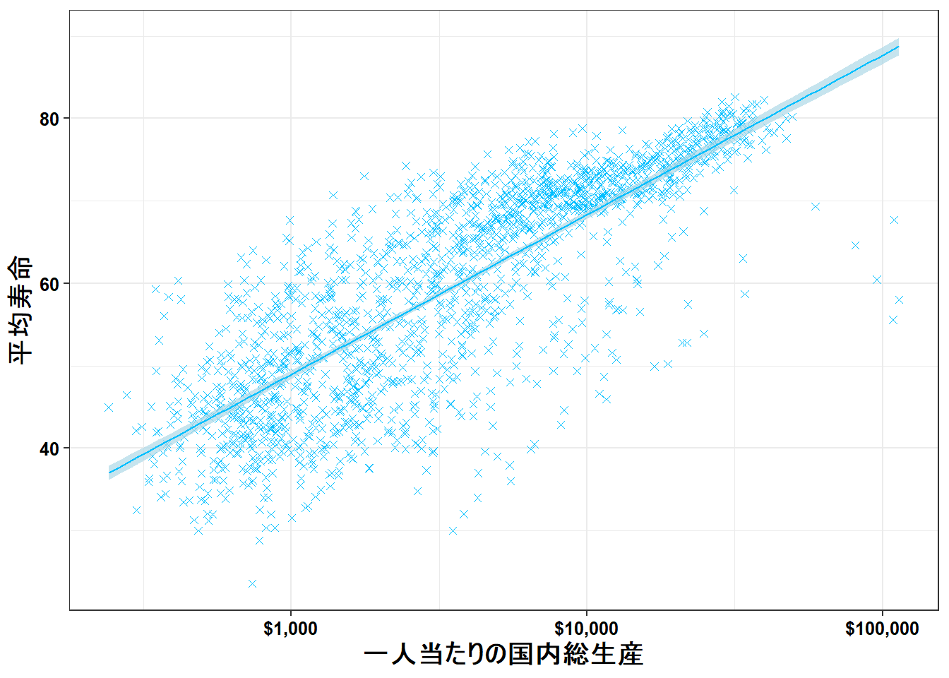
2.2.1 グループ分けして図示
2.2.1.1 離散値
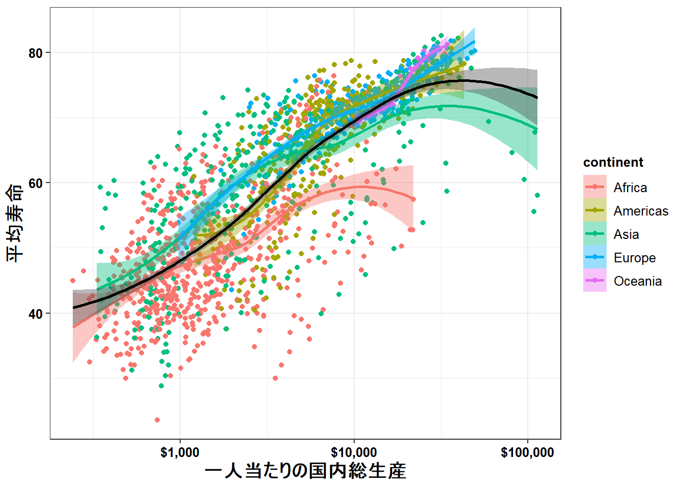
実はこれまでの図は、ちがうデータを一色淡にして表示していた。これを大陸ごとに分けて表示するとどうなるだろう。
ggplot(gapminder,
       aes(x = gdpPercap,
           y = lifeExp,
           color = continent,
           fill = continent)) +
  geom_point() +
  geom_smooth(method = "loess") +
  scale_x_log10(labels = scales::dollar) + # ドル表示に変更
  theme_bw() + # 白地罫線に指定
  labs_pubr() +   # 軸タイトルのフォントとサイズを指定
  labs(x = "一人当たりの国内総生産",
       y = "平均寿命")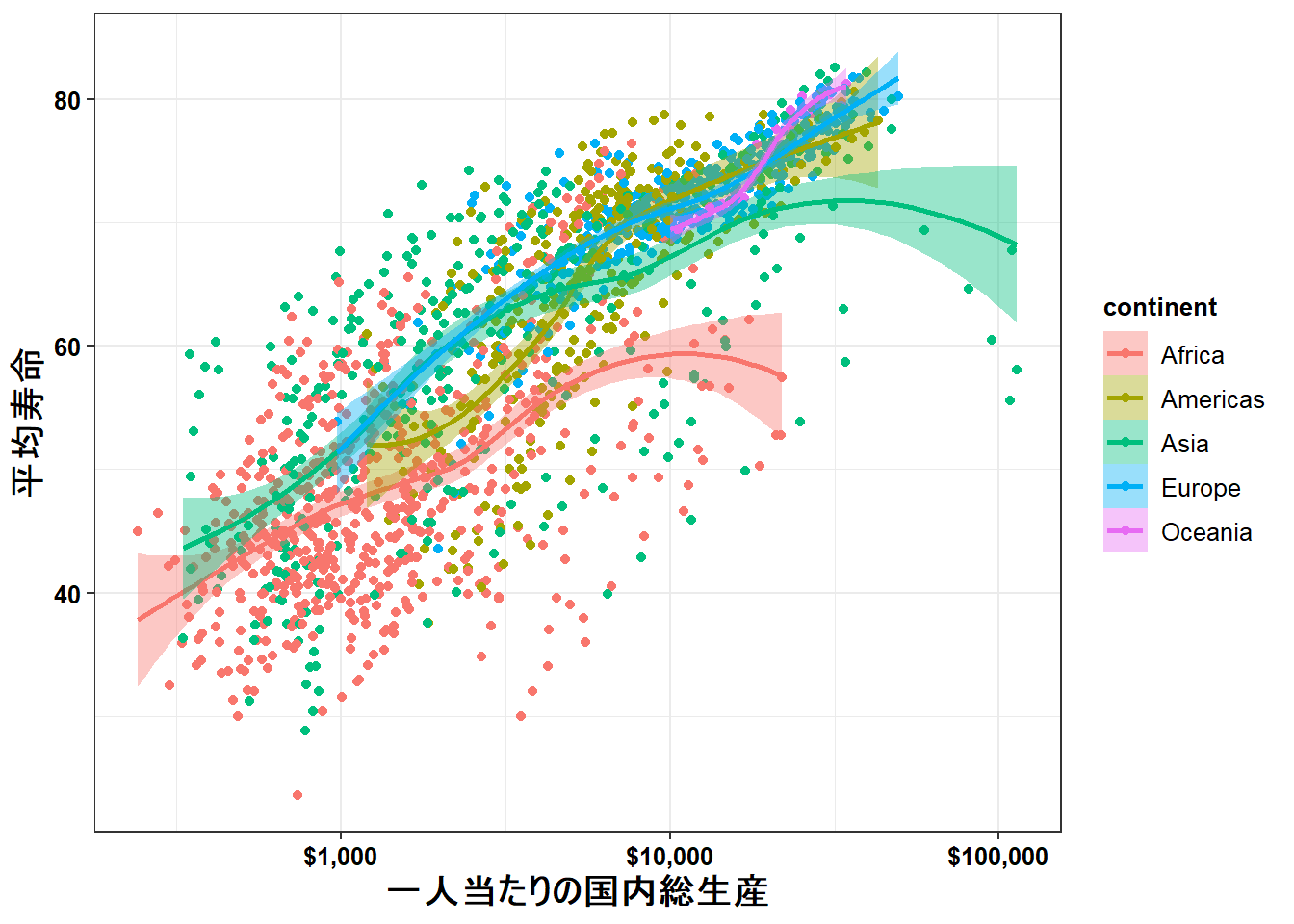
これに全体のデータに対する回帰曲線も描ける。
ポイントは、aes()をggplot()の中から、個別具体的に指示しているgeom_xx()の中に入れてあげること。図示される順番は先にコードされたものが下、後のものが上に描かれる。
ggplot(gapminder,
       aes(x = gdpPercap,
           y = lifeExp)) +
  geom_point(aes(color = continent,
                  fill = continent)) +
  geom_smooth(method = "loess",
              aes(color = continent,
                  fill = continent)) +
  geom_smooth(method = "loess",
              color = "black",
              fill = "grey30") +
  scale_x_log10(labels = scales::dollar) + # ドル表示に変更
  theme_bw() + # 白地罫線に指定
  labs_pubr() +   # 軸タイトルのフォントとサイズを指定
  labs(x = "一人当たりの国内総生産",
       y = "平均寿命")